Jacob Wardle AS Media
Friday, 27 March 2015
Monday, 23 March 2015
Tuesday, 10 March 2015
Saturday, 28 February 2015
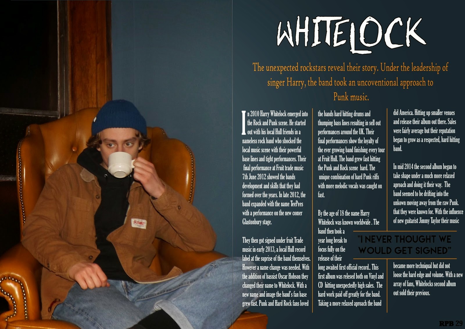
Question 1 – In what way does your media product use, develop or challenge forms and conventions of real media products?

I have shown continuity through the front cover, contents
page and double page spread through colour, font and by having the same person
on each. This is conventional of music magazines showing my product to develop
forms and conventions of real magazines. I have also used the mast head on each
product increasing the continuity throughout the magazine; this is also done on
MOJO magazine which is of a similar genre and therefore a similar target
audience.
Overall, my front cover, contents page and double page
spread conform to the conventions of a magazine of the Rock genre. This is done
on the cover through the use of different fonts and text sizes, a medium
close-up image, the use of a plug, barcode and price and the limitation to
three colours which are carried through to the contents and double page spread.
My contents page conforms to conventions through its column of feature and page
numbers, multiple images, also a subscribe information section featuring past
covers of the magazine and title including the mast head. These are all
conventional of a contents page and share the same colours and fonts as the
cover and double page spread. My double page spread also follows conventions
and could be seen in an existing rock magazine. It has done this through the
continuity of colour over both pages, the used if columns, drop cat, title,
stand first and a pull quote. It also follows the same orange theme throughout.
Friday, 27 February 2015
Subscribe to:
Comments (Atom)


